
RSA REBRAND
Resident Student Association at Northeastern University
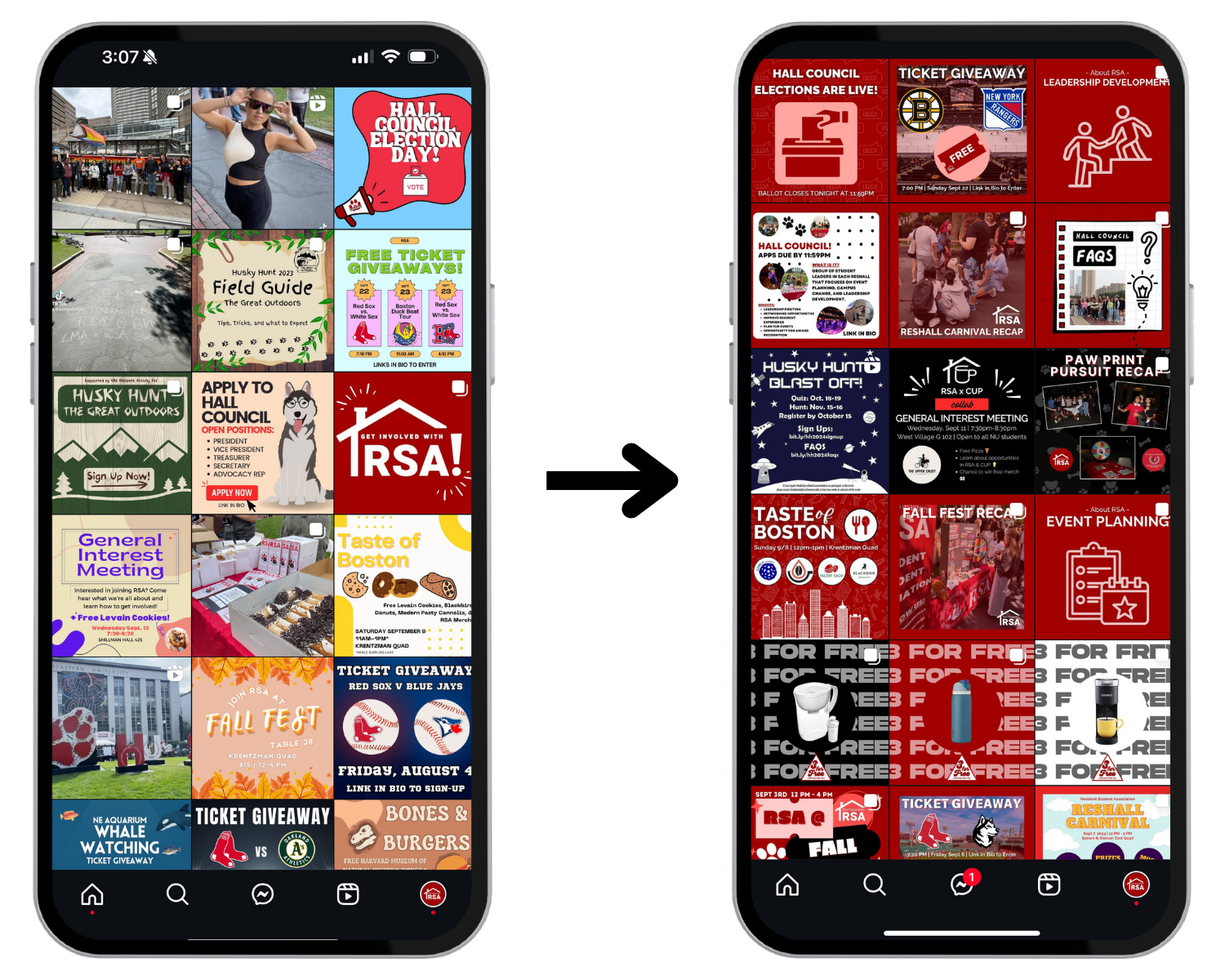
INSTAGRAM REFRESH
~ Recognized the inconsistency and weak brand as an opportunity for growth.
~ Created and executed a cohesive brand design with consistent fonts, colors, and design elements to increase brand recognition.
~ Increased engagement and professionalism across the page by transforming a cluttered feed into a visually unified and recognizable social media presence.
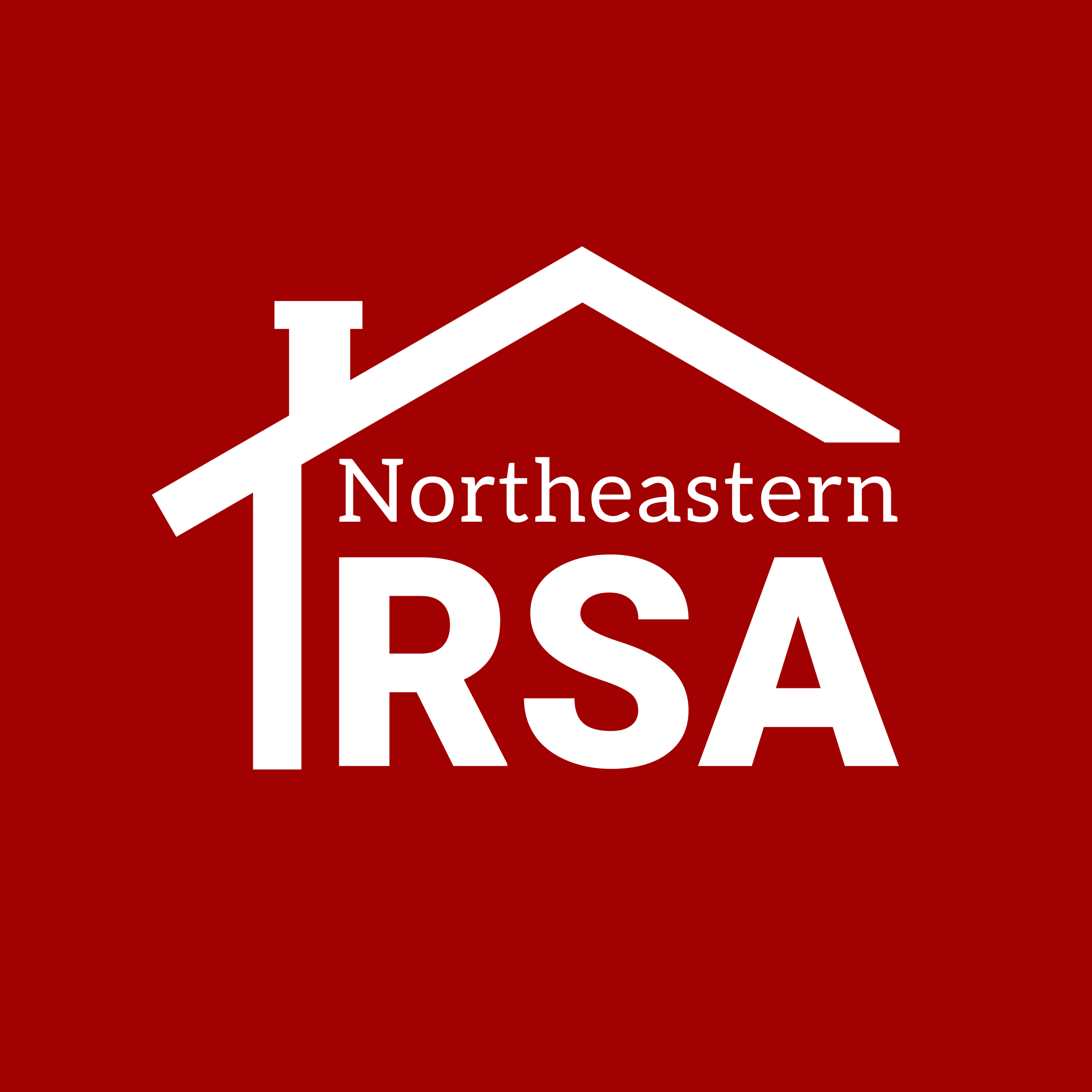
LOGO REFRESH

I took the initiative to refresh the RSA logo to improve its overall functionality by simplifying and modernizing it. This is in line with industry design trends and standards, as we see a lot of brands toning down their logos to be more adaptable and scalable in a changing world. I saw an opportunity to create a new logo design that feels more contemporary while still maintaining the identity of the organization. The previous logo contained a high-level of detail, which made it difficult to scale efficiently across digital platforms. By simplifying the design, the updated logo becomes more versatile with the iconic roof design, recognizable, and adaptable for the digital world. Additionally, the redesign makes the logo far easier and more cost-effective to print on merchandise, especially for smaller imprint areas where intricate details can become unclear or lost.
REASONING

example of the versatility of the new logo, where I made a co-branded logo with RSA and the Council for University Programs (CUP)